SEIPIA
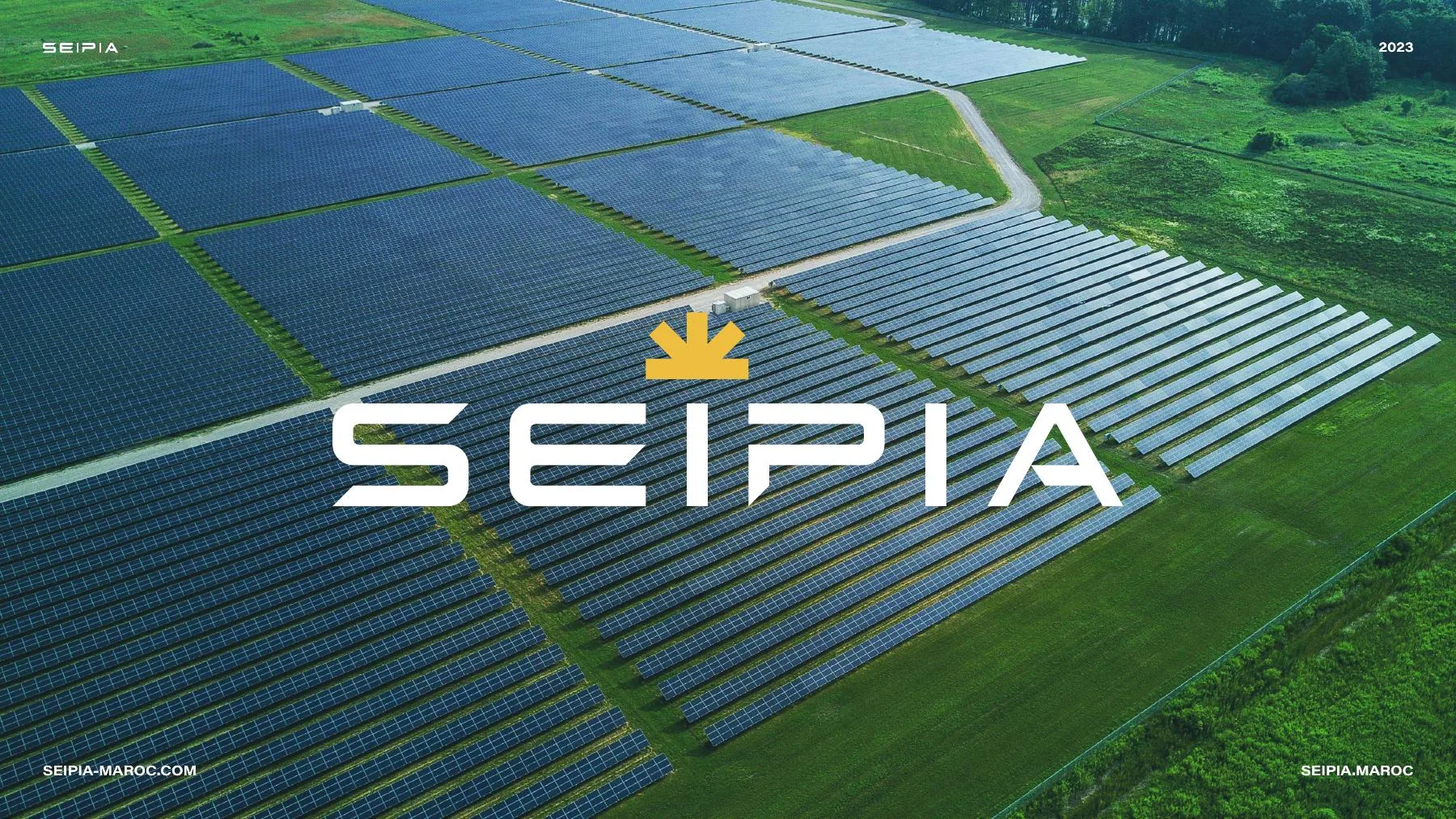
An identity for an energy and industrial technology company, where the sun meets industry.
Client
SEIPIA
Industry
Solar Energy & Industry
Location
Morocco
Our role
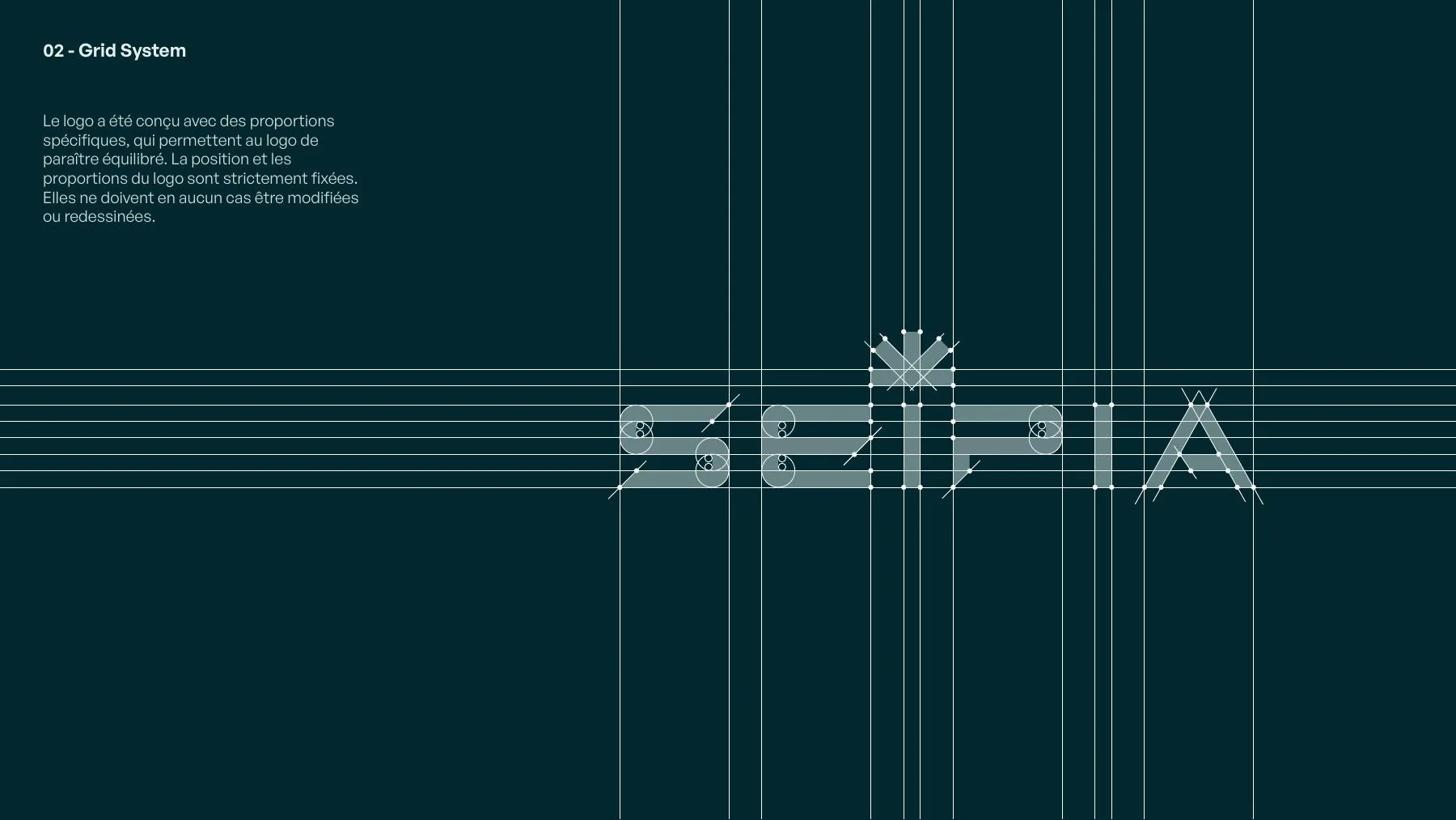
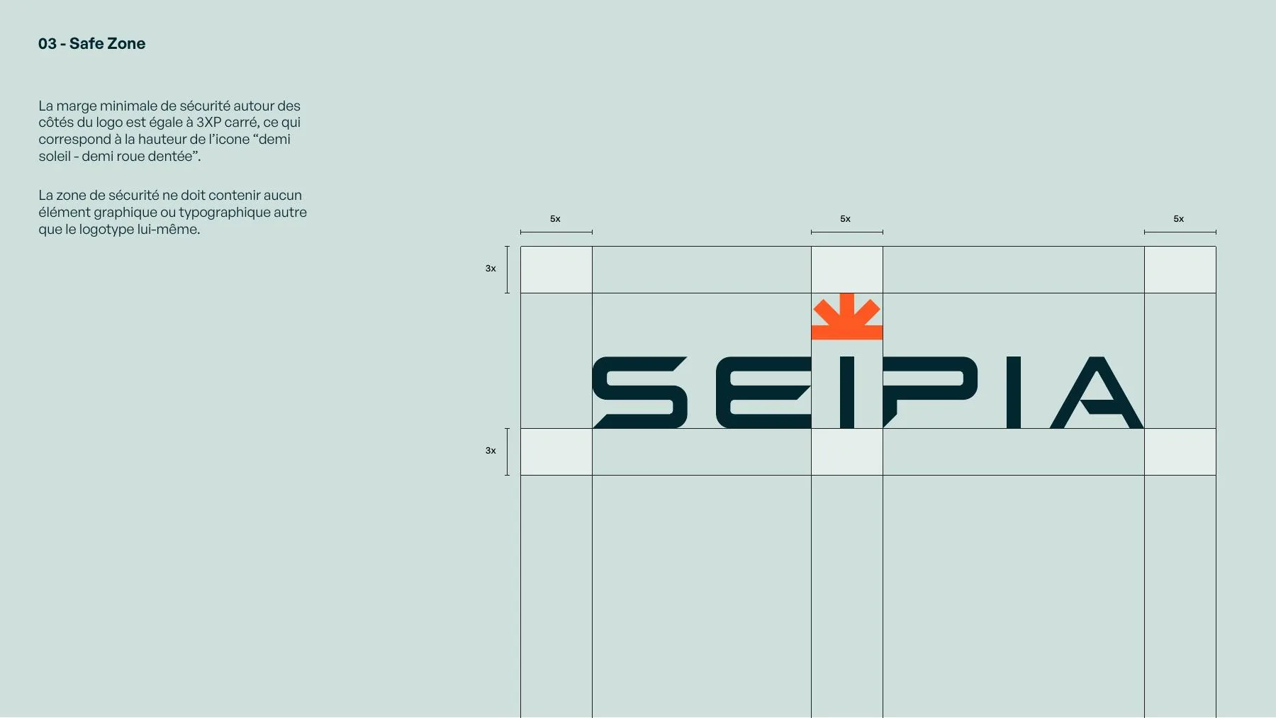
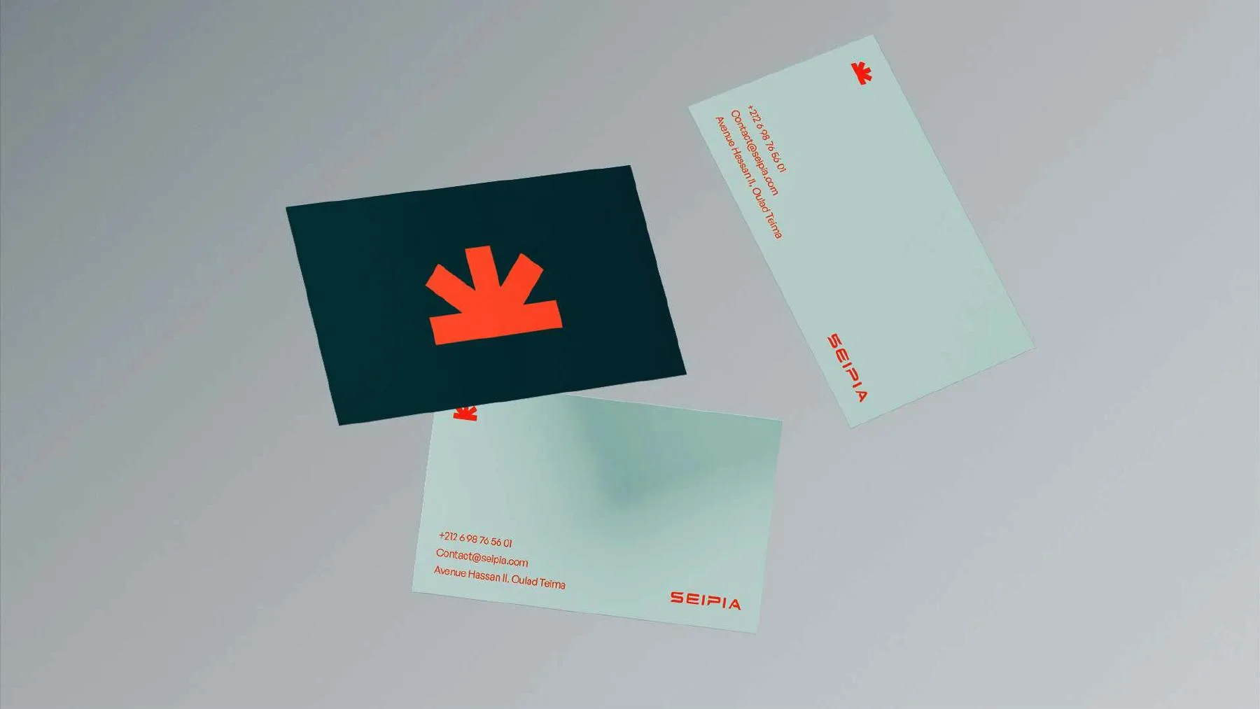
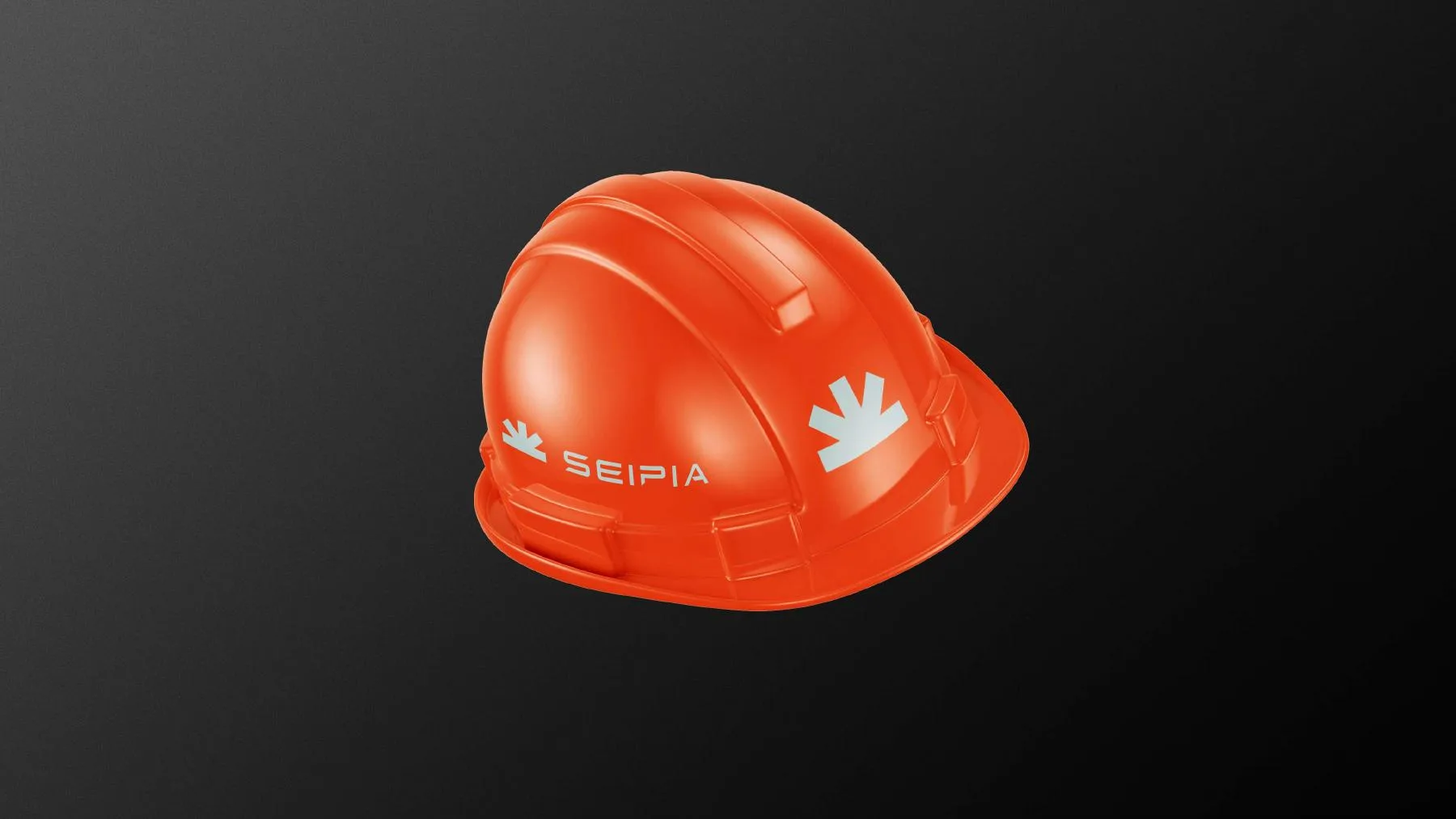
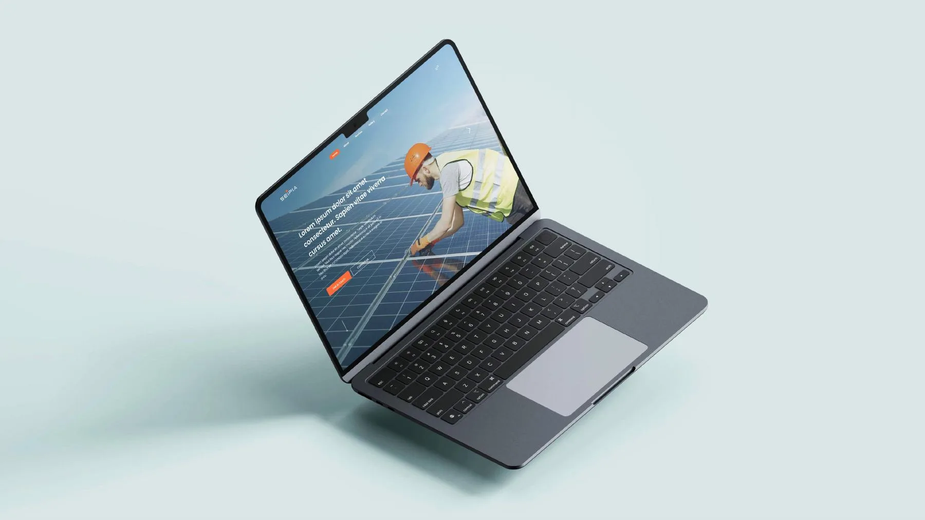
Logo & Icon Design · Grid System & Safe Zone · Brand Colours · Brand Applications & Mockups
The solution
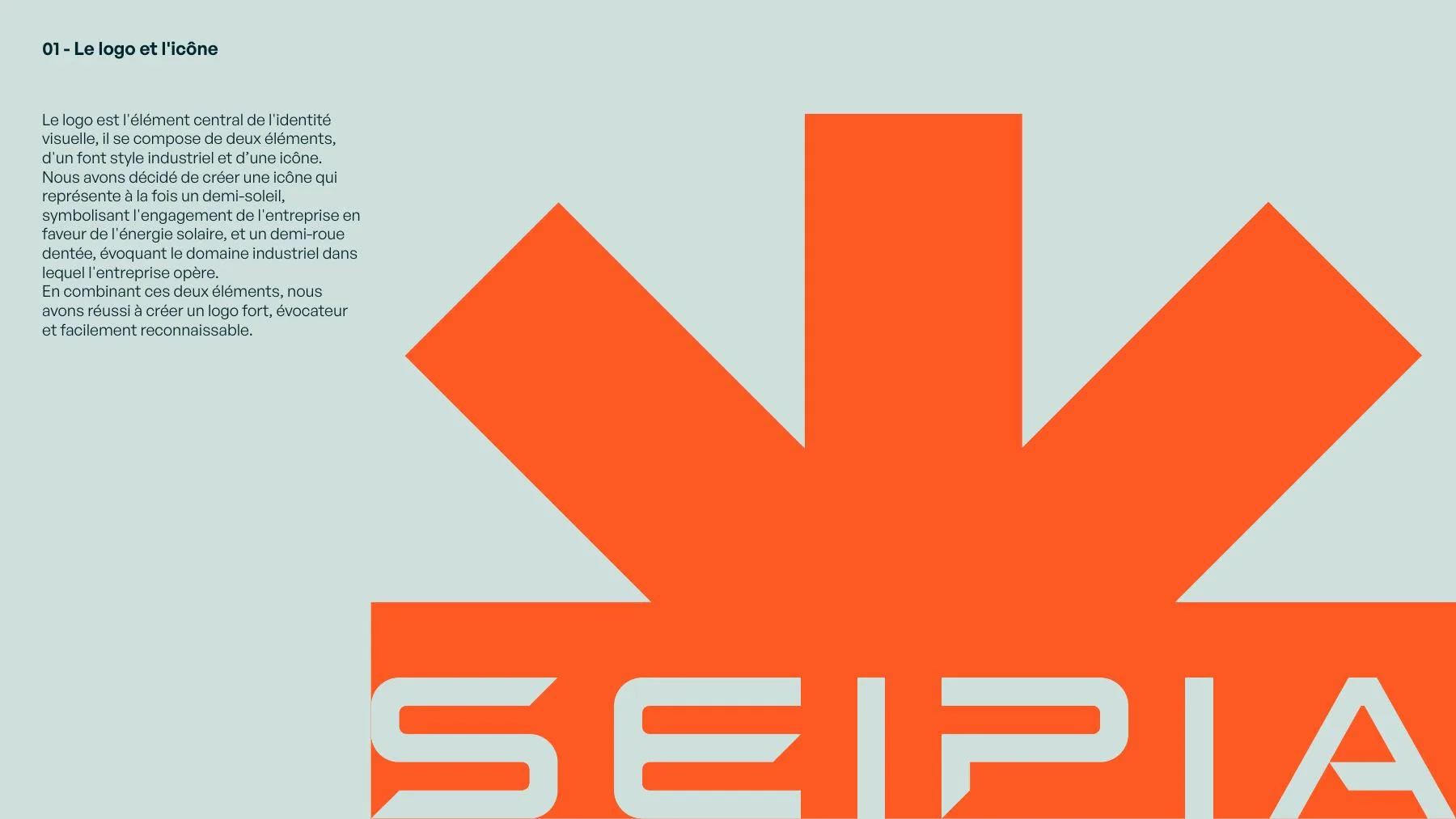
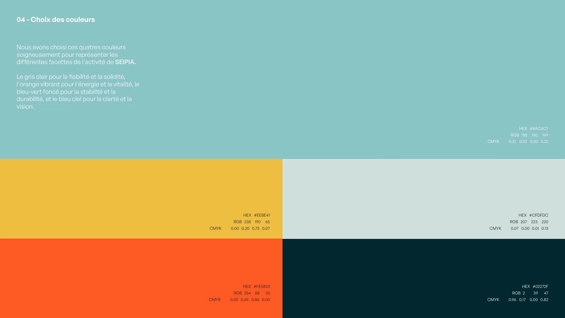
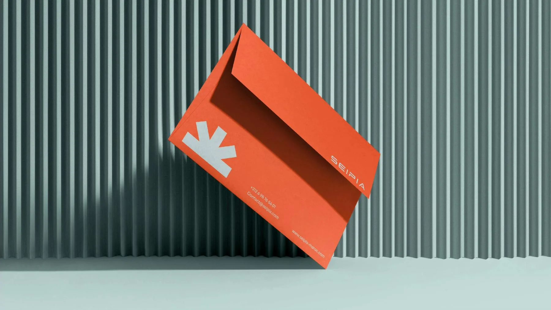
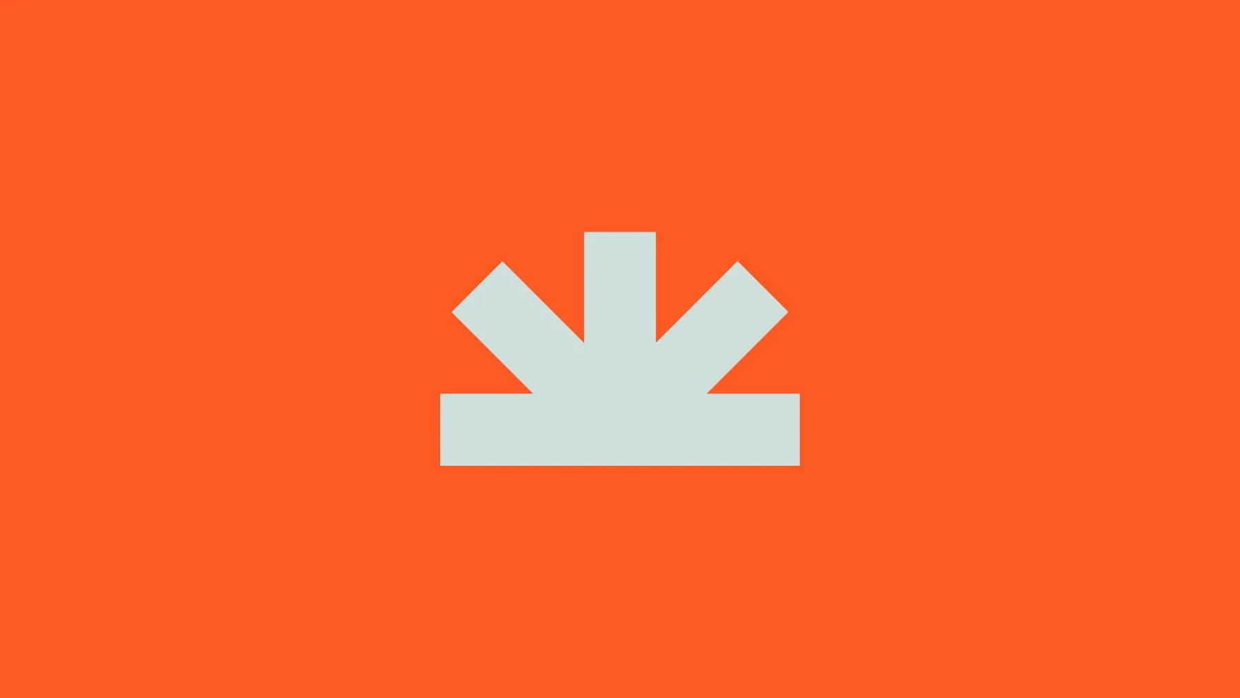
We created an icon that is half rising sun and half gear: a symbol of the company's commitment to solar energy and the industrial field it works in. An industrial typeface and four carefully chosen colours (light grey for reliability, vibrant orange for energy, deep teal for stability, and sky blue for vision) complete a strong, recognisable identity.
Your next chapter deserves
a stronger brand.
A new direction. A stronger identity. Marketing that feels like you. Tell us what you’re ready to change, and let’s talk about what comes next.
Let’s talk